Mobile payment application “Billos” design journey
End to end UX Research and UI Design Case Study
Introduction
This case study presents a new technology for a payment system that can be used to pay restaurant bills, with minimum interaction with the servers. As we all know, dining in the company of friends and family sounds like a lot of fun and pleasure, until the time comes to pay the bill. Paying bills in the mind of any person is not the most pleasant experience. Therefore, I set the goal to make this experience faster, easier and more fun, using this new payment system.
For the last four months, I have been conducting intense UX research and crafting the UI style guide of this project, and as a result of that, I have created the ultimate design of the application.
The following case study presents all the details and aspects of this project.
Empathize
-
Problem
What if a customer is in a hurry and the bill is not coming?
What if the customer is late and the waiter is busy with another guest?
What if the customer wants to pay the bill himself without showing it to other guests at the table?
What if the customer wants to split the bill with other people?
What if the customer doesn’t want to touch (Insight found during COVID-19) the payment terminal or give the card to the waiter?
The questions above were living in my head for many years while I was working in the restaurant as a server. That was the reason why I chose the problem of “Waiting for the bill in the restaurant” for my first UX/UI design project. As a former server, quality assurance engineer, and novice designer, I believe that the experience of “paying the bill”, can be improved using new ideas, innovations, and technology.
-
UX Research
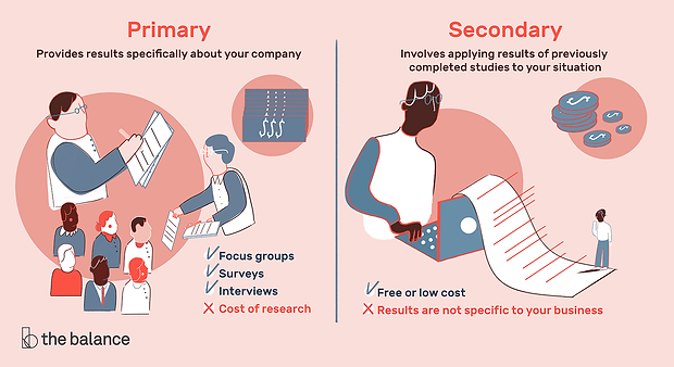
User Experience research is essential for the success of a new product. It generally involves two different types of research: primary and secondary. In this section, I will talk about both concepts.
-
Secondary Research
To find the appropriate data for the project, I started to study the problem with the secondary research method, where I explored people’s experience, the technical progress in this field, the state of the restaurant business, and the payment statistics. The outcome of this research granted me a clear understanding of the restaurant’s payment system. The following list few of my findings:
-
The number of restaurants is increasing every year, and the desire of people to eat outside is growing
-
Technologies are evolving, and the guests expect that the restaurants will refine their service as a result of that
-
People are completely open to paying their bills online, as it is simple, convenient, and trackable
Secondary research internet sources:
-
Toast ( Restaurant Success in 2019 — Industry Report)
-
Fit Small Business (restaurant statistics)
-
The National Restaurant Association (Report)
-
Gloria Food (Statistics)
-
HubSpot (Statistics)
-
The Pew Charitable Trusts (Pew Research Center and Pew’s mobile payment survey Report)
-
Primary Research
The goal of the research:
-
Identify and acquire knowledge and data about the potential consumers
-
Assess, study and understand people’s needs, frustrations, and satisfactions
-
Verify the usefulness of the product from a customer perspective
In order to recruit the right participants that are viable to the data gathering of this project. I created a survey and selected 5 ideal participants (2 male, 3 female), based on these criteria:
-
Age 21–50
-
Frequent restaurant’s customers
-
Active users of mobile banking, online shopping, food delivery services, and online payment applications
-
Expressed interest in new mobile technologies and services
Link for Mobile Payment in Restaurant Survey
Then, I conducted face to face interviews with these participants, which I will describe more in the Define phase of this project.
Define
-
Affinity Mapping
Using the Post-it app, I created the affinity mapping to distribute the gathered interview notes into sections.

Based on the collected data I unveiled priceless insights that laid the foundations of the human-centered design product, user’s needs, and frustrations:
-
People don’t want to wait for the bill in a restaurant
-
People don’t like to calculate tips
-
People want to have an option to split the bill
-
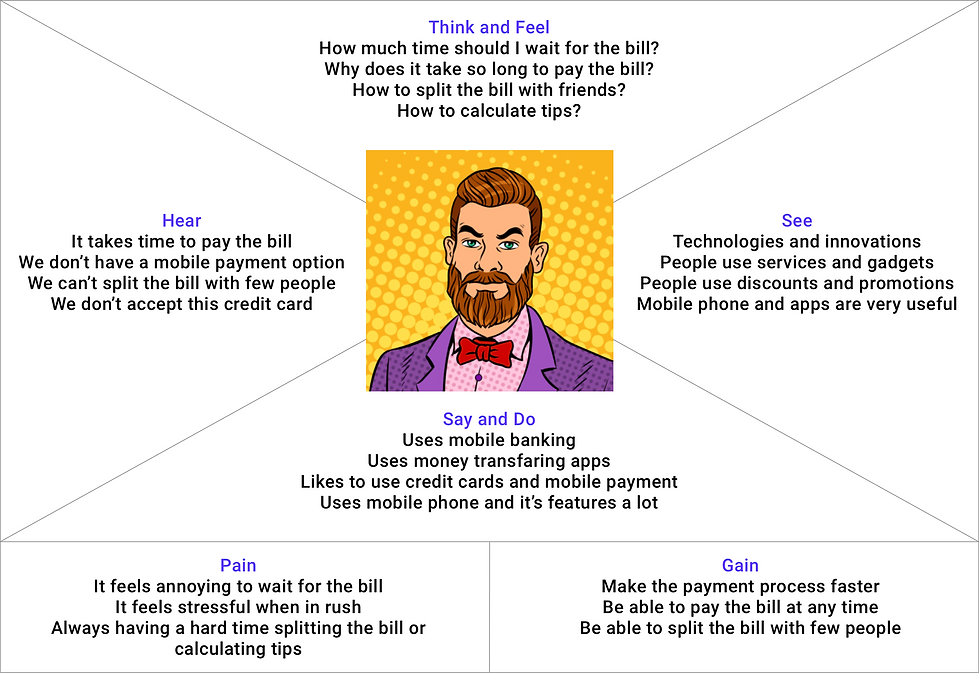
Empathy mapping
I created the Empathy mapping by organizing: insights, observations, and quotes collected from the user interview to understand the user’s pain points, goals, feelings, thoughts, and behaviors.
-
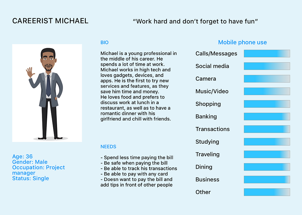
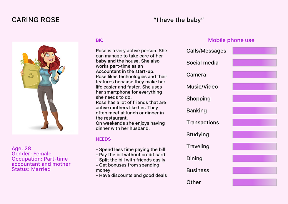
Personas
I narrowed my selection of the target audience into two personas, who represent two types of users by gender, occupation, and personality.
User characteristics can be presented partially or simultaneously in both personas.
-
How Might We
I used the “How Might We” questions technique to reframe insights and articulate the problem statement:
1. “How Might We” help customers in restaurants get and pay their bills faster?
2. “How Might We” make tips calculation convenient and simple?
3. “How Might We” support sharing the bill in a restaurant over multiple people?
4. “How Might We” use our knowledge of features and other services, as well as people’s desire for technologies in new products?
Ideate
-
Brainstorming
Throughout the design thinking process, I was brainstorming and visualizing solutions for the product that adequately addresses potential user’s needs. I had a solid understanding of what the users want to see, in order to make their payment experience simple and convenient. I started to explore my ideas by sketching the main flow of the application with a pen and paper, which is shown in the image below.

-
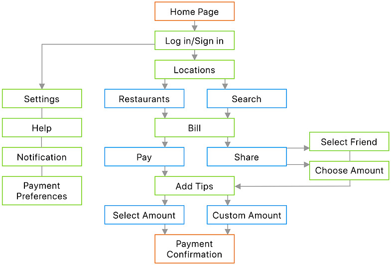
User Flow
Information architecture is an essential and complex process. How the content is organized and presented, directly influences the success of the user experience.
I created the user flow to show a visual representation of specific routes that the user can take through the app to achieve the goal. The red routes are critical to the design and are an essential part of product success. The peripheral and outgoing features were incrementally added during the prototype phase.
-
Heuristic Analysis of Competitors
For the Heuristic evaluation, I chose three software products relying on the insights found in previously conducted research. All three competitors are leaders in three categories of payment and money transferring services that solve tasks and satisfy needs different from each other.
-
The first insight is “people don’t want to wait for the bill in a restaurant” ideally resolved by Zapper mobile application that allows users to make fast, easy, and secure payments with their smartphone without having to call the waiter back to the table.


-
The second insight “people don’t like to calculate tips”, is ideally resolved by Square. The app has a user-friendly and easy tip calculation feature. Square combines software with hardware to enable sellers to turn mobile devices and computing devices into payments and point-of-sale solutions.
-
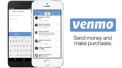
The third insight “people want to have an option to split the bill” is covered by the Venmo app. It is the absolute leader in money transferring service with a simple intuitive interface and good technical implementation.
Learning from the experience of Zapper, Square, and Venmo software products, I wanted to emphasize on combining their best features and options. The latter also creates one versatile product that mitigates the downsides of each one of these products, as well as helps improve the customer experience by making it easier, modern and up to date with our latest technology advancements.
My goal here is to grant the client a very enjoyable experience when they are paying their bills after visiting a restaurant.
-
Sketching
In order to bring my ideas to life, I started from the red routes and created sketches of the screens that make up the critical user flows.
In addition, I made use of the blank iPhone template, as it saved me time on drawing a device frame, as well as making the sketches look more natural.

-
Guerilla Usability Testing
“Test early and test often” is my statement of faith. Every mistake takes more time to fix than it takes to make, hence the time and debug cost can be dire.
In order to avoid mistakes in the later stage, it is recommended to identify these mistakes and fix them early on. Therefore, using the agile methodology is the right choice since it involves continuous and iterative testing at all stages of the project that is crucial to its success.
I conducted the guerilla usability testing on 5 participants in order to get initial feedback and learn what people like about the design and what other aspects of the design are less intuitive.
Usability testing was performed online via Skype and using the Marvel POP prototype tool, due to the COVID-19 circumstances. Here is the list of my findings:
-
People prefer to see the “Search” field on the top of the screen
-
People prefer to see the “Split” CTA button instead of the “Share” on the “Your bill” page
-
People prefer to see the “Pay” CTA button instead of the “Submit on the “Your bill” page
-
People would like to see more options in the “Split” feature, like “equally” and “by percent”, “by Item”, “by the amount”
-
People want to see the “Total amount” on the “Tips” and “Split” page
The low fidelity design sketches turned the idea into testable artifacts that I used for the testing to collect and analyze feedback.
-
Wireframing
The wireframe is a critical part of the interaction design process that implies building the layout of the app and demonstrates what interface elements will exist on key pages.
At this stage, I started to work on digitized versions of sketches and identify critical design decisions that I need to make. Wireframing helped me to frame the visual guide that represents the skeletal framework of the app.
I combined all wireframes in the wire flow and transformed it into an interactive iPhone prototype in the Marvel POP prototype tool that I used for usability testing. The user tests helped me flag certain aspects of the project that need to be adjusted. I learned that the user’s feedback is essential for optimizing the customer experience and that it is an unlimited source for fresh and brilliant ideas and flashes of inspiration.
-
Brand Platform
Billos brand platform is associated with creativity, user-friendliness, interface simplicity, and efficiency. The following graph presents each aspect of the Billos brand platform.

-
Moodboard
This moodboard represents the visual aesthetics that I incorporated into the UI of the product. It reflects the brand personality and brand attributes.
The choice of colors and the entire look was influenced by the artistic styles of modernism, urbanism, and pop art.
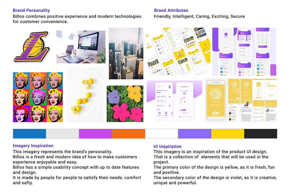
This moodboard is the prompt and trend for color, typography, imagery, and mood of the style guide.
-
Style Guide
Based on the brand platform and the moodboard, I created a style guide that has a set of rules and design standards for the Billos application. This style guide ensures that these standards are consistent and uniform for all pages of the product.
The logo is the primary point of recognition of the product, and it is the most common graphical representation of the brand identity.
It introduces people to the name of the company, its visual symbol which represents the brand personality.
-
Color palette
The brand identity color palette is the way of creating a vibrant visual experience with the target audience, while simultaneously showcasing the unique personality.
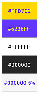
#FFD702 shade of yellow is the primary color. It is used for the menu and call to action buttons.
#6236FF the medium-light shade of blue-magenta is the secondary color. It is used for the typography.
#FFFFFF white color is the background color. It is used for 90% of the design.
#000000 black color is the accent color. It is used for the typography.
#000000 5% opacity grey color. It is used for the text box highlight.
This color palette is a carefully chosen set of colors. It came from the visual design project. It sets the tone of the app and creates an emotional connection between that product and the user.
-
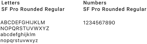
Typography
The font directly affects product readability and utilization. In the Billos app, I used the suggested font from Human interface guidelines by Apple, please refer to the following link: https://developer.apple.com/fonts/. The font type SF Pro was the choice to proceed with.
This sans-serif typeface is the system font for iOS, macOS, and tvOS, and includes a rounded variant. It provides a consistent, legible, and friendly typographic voice.
-
UI Elements
UI Elements are the visual elements in the application that respond to user interactions.
The interface inventory helped me identify and define the most common UI elements for the project. In addition, to adding pages that are dedicated to these elements to the style guide.

-
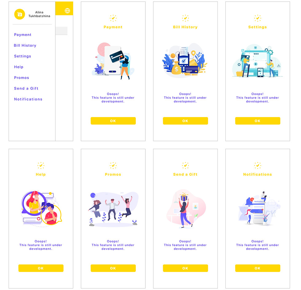
Imagery
Imagery is an essential part of setting the tone of the product, as well as reinforcing the brand personality and its emotional connections with the users.
First-time users very often have pages with an empty history, activity, and information. Some pages might be under development, in that case, illustrations instead of blank pages can make the users feel comfortable or encourage them to take action.
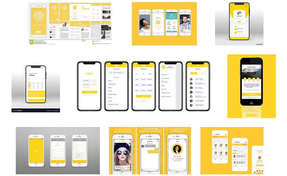
I used Illustrations from Dribble and Unsplash platforms that are used by designers, photographers, and creatives. The following image presents some of Billos illustrations.
-
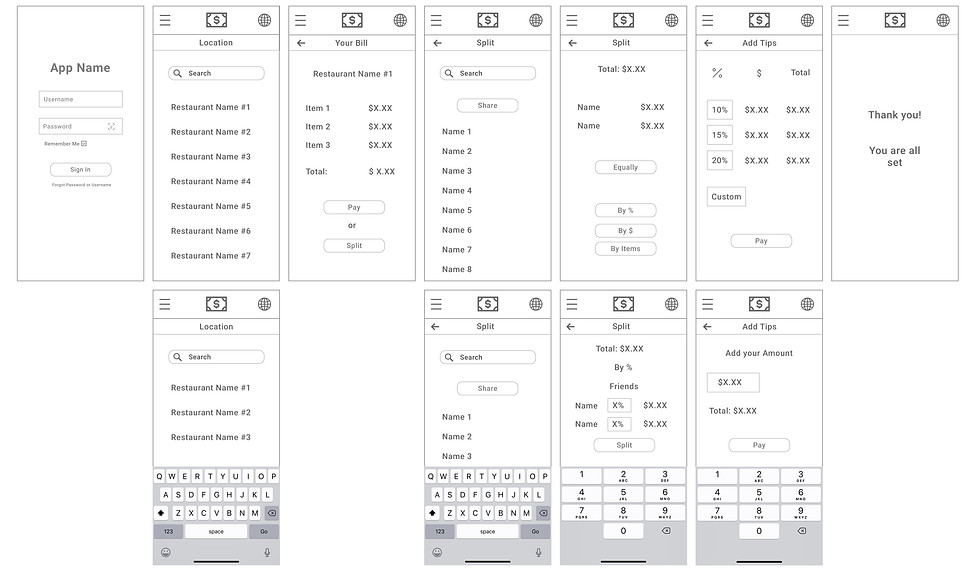
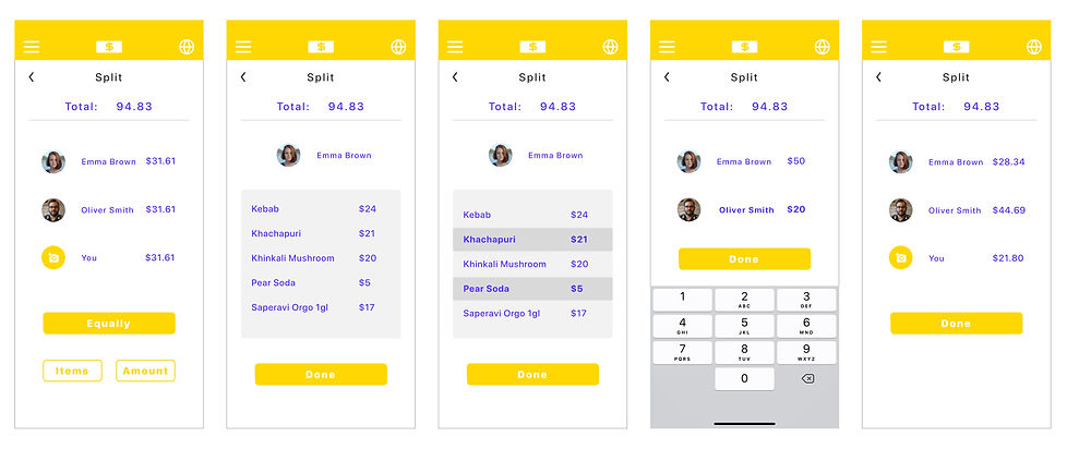
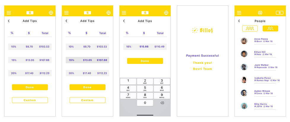
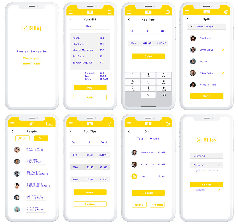
High Fidelity Mockups
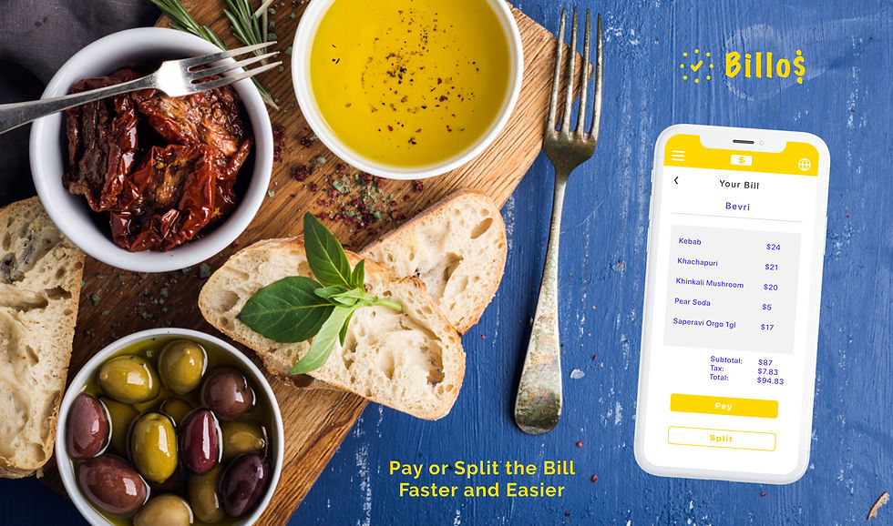
This stage of the design thinking process accurately represents the final version of the user interface (UI) look. Which contains elements, granular UI details, that were missing in the low-fidelity predecessors. The product design is fully fleshed-out and aligned with the style guide and the brand platform. The following captures, shows various pages of the major user flows:
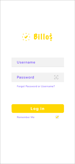
Sign in page — Location page — Location page with the keyboard — Location page with the error message — Bill page

Split with people page — Split with people page with the error message — Split with people page with the keyboard — Split with people page with keyboard and 1 person selected — Split with people page with 2 persons selected
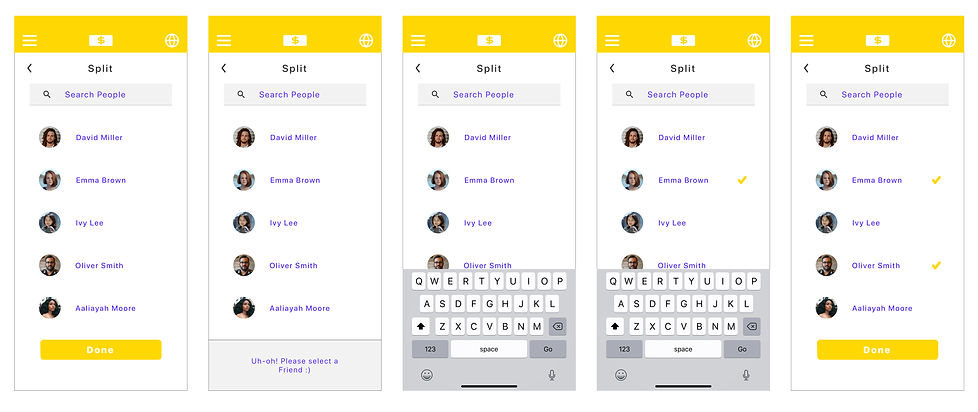
Split with selected people page — Split with people page by items — Split with people page by items selected items — Split with people page customize amount option — Split with people page total customized amount
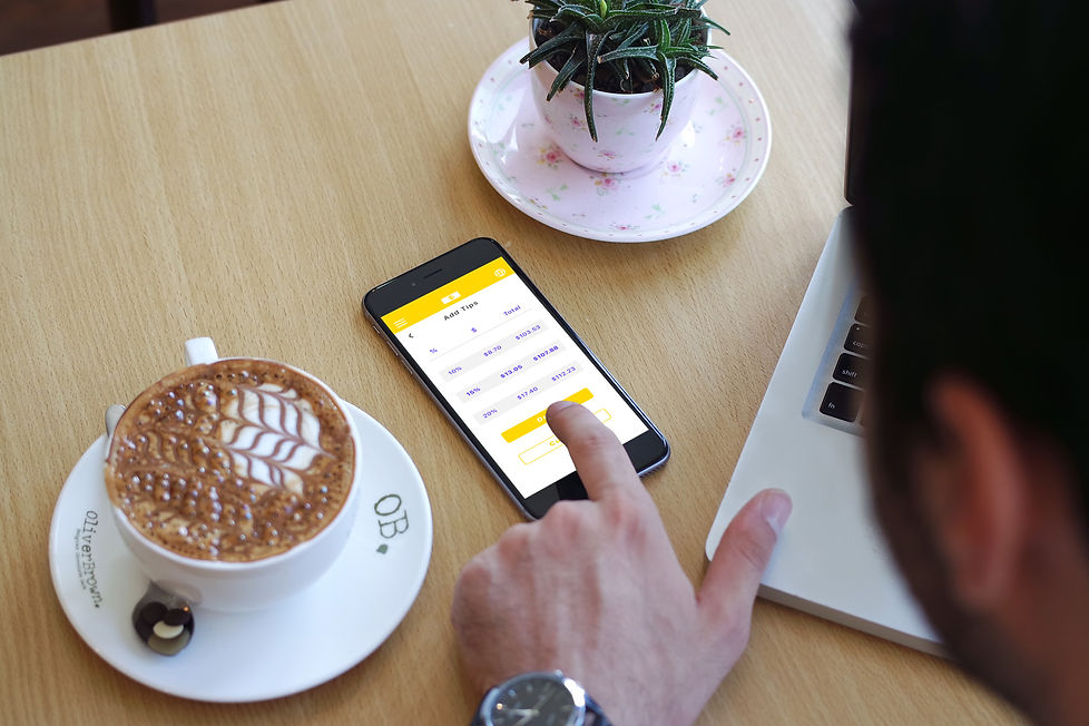
Add tips page — Add tips page with the selected option — Add tips page customize option — Payment successful page — People’s experience page
-
Accessibility Audit
A comprehensive manual test of the product functionality and design has been performed over multiple users in order to find issues and defects that can be encountered while navigating key tasks throughout the application. One of the key findings that have been discovered by the users is that all the elements are easily visible and noticeable.
In order to further validate Billos design, I created the board that is shown in the figure below, where Billos design is presented in the center while other designs are placed around it. After comparing Billos with the other products that are designed in the same color and contrast spectrum, I found out that the other products have a very similar color, contrast, and style.
Prototype and Test
A high-fidelity prototype is an interactive representation of the product in its closest resemblance to the final design in terms of details and functionality. Using the InVision digital product design platform, I created the interactive prototype of the Billos application, and in order to access it, please use the clickable link below (originally made for the iPhone 11 Pro Max).
https://alinatukhbatshina20240.invisionapp.com/console/share/591FVUTCWT/479888609
Please feel free to explore the product and leave your feedback. It is extremely valuable to me and helpful for my growth in design, to hear various opinions and comments regarding my work.
This design successfully passed the usability testing with 5 participants. The following points are the usability test goals:
-
Understand how real users interact with the product
-
Find out usability problems with the design that should be improved
-
Identify if users are able to complete tasks successfully
The following are a few findings from the usability testing:
-
A missing page that confused the participant was found. The user flow was not clear and the problem was fixed.
-
The sidebar was closing when the user tapped outside of it only. The problem was fixed by making a larger hotspot.
-
The design was made for the larger screen size
I fixed the discovered issues and added the missing pages. Overall, the users described their experience as a positive one, and the design as intuitive, userfriendly, useful, and fresh.
Animation
Using the Principle Animation tool I built a few screen animation movies/gifs demonstrating screen transitions and visual feedback for key UI elements.


Conclusion
That was my first capstone project in Springboard school (UX/UI Design). During the work on this project, I mastered design and prototype tools such as Sketch, Invision, Marvel POP, and Principle. Also, I learned to use secondary and primary research methodologies, conduct interviews and usability testings, sketch, wireframe, and prototype. Working on the project as an end to end UX researcher and UI designer I experienced and understood all stages of the design thinking process.
After four months of experimentations and trials on how to tackle the issue of “Waiting for the bill at the restaurant”, I came up with the idea and design of Billos, which resulted in a complete application prototype with a Minimum Viable Product (MVP) features, unique Design, and embodied Idea. I dare to portray that the “Billos” project is a small leap into the great future of the payment pattern.