GV (Google Venture) Design Sprint Case Study
GalleryPal Design Sprint Challenge
-
The sprint is a five-day process for answering critical business questions through design, prototyping and testing ideas with customers.
GalleryPal is a new startup that wants to improve the experience of viewing art in a museum or a gallery. It has brought me on to run a design sprint and quickly come up with a possible solution.
Design Sprint: Day 1 — Understand/Map
-
Review Research and Personas
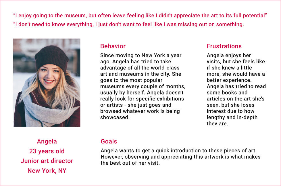
I asked the users to “Tell me about a recent time when they visited an art museum or a gallery”. The objective of this exercise is to gather information about people’s experiences while visiting a museum. The following list describes every person’s experience that I have interviewed in this project.
-
Nick, sometimes does a quick Google search on the mobile phone for painting, while he is at the museum. But the articles he finds are long and super overwhelming.
-
Anna enjoys looking at art, but sometimes she feels that she is missing out on the full experience by not knowing any background information or context.
-
Ryan doesn’t like group tours, because he enjoys art alone. But sometimes he joins a group tour to listen and learn new facts about the artist or the piece of art.
-
Jane likes to form her own opinion about the art but it is hard to do that without knowing anything about the artist, or what intentions were in creating the work.
-
Dana often asks herself “how did the artist do that?” She would love to know more about the art process and techniques.
-
Claire does a little research about the exhibitions, art galleries, and work of art. Prior to visiting a gallery or a museum, but she stumbles upon a work of art that catches her eye that she didn’t read about.
-
Liza is wondering what would the artist tell her about his work, if she meets him in person, and how nice it would be for that to happen.
-
Problem Identification
People love to learn about art and history. Hence they go to museums, exhibitions, and art galleries. Visiting museums and art gallery has several benefits: it is educational, cultural, and fun as well. While at the museum, many people want to know more about the artwork, its author, and the history of its appearance, and most of the time, visitors turn to the internet to find this information. But the downside is that there is no consolidation of this information, but rather, they quickly lose interest when they get overwhelmed with the amount of information that they find. Therefore, in this case study, I will be working on improving the visitor experience at the museum, and create a smart presentation of information product.
-
Site Map
The app has three major user flows:
-
Scan the art object, get the information, listen to the audio or save the page
-
Find the museum/art gallery, get the information
-
Find the artist/art object, get the information

-
Ideas
Before starting to sketch I made a list of ideas about content, units, and pages of the application.

-
Recruiting
I started to recruit people for the fifth-day testing. On the last day of the GV design sprint, I plan to have 5 participants that are aligned with the product.
Design Sprint: Day 2 — Sketching
-
Exploration
The second day of a design sprint is dedicated to sketching. I took the advice of some experts at GV and looked at the products with some ideas that I like, in order to inspire myself for experimentation and ideas exploration. I used those products interfaces, elements, and screens as examples and possible solutions for my product.
The first product that came to my mind was the website of my favorite museum MoMa (The Museum of Modern Art, New York), and their mobile application MoMa Audio. The web site gave me a clear understanding of what kind of content and features can be in my application. Moma Audio was a great example of the audio guide. The app includes an audio guide for every artwork, made up by the curators, historians, and artists.
The American Museum of Natural History in New York City has a well-rounded app called Explorer. This app is designed to allow the user to guide themselves throughout their visit to the museum, giving them the option to select what they are interested in beforehand. This app perfectly utilizes many of the key features for a museum app, including digital maps and information.
The next application that I wanted to use as an inspiration, is the Google app, as I always admired the idea of an article inserted in a card and a carousel with smaller cards related to a specific subject. In addition, the application has the Lens feature which is the perfect solution for identifying an object in the search field.
I also looked at the Amazon app to see the recommendation feature based on the experience and interests, that I also will include in my product.
The YouTube app gave me an idea of a carousel of different topics in the shape of a capsule that I can use to navigate the user to get more information.
-
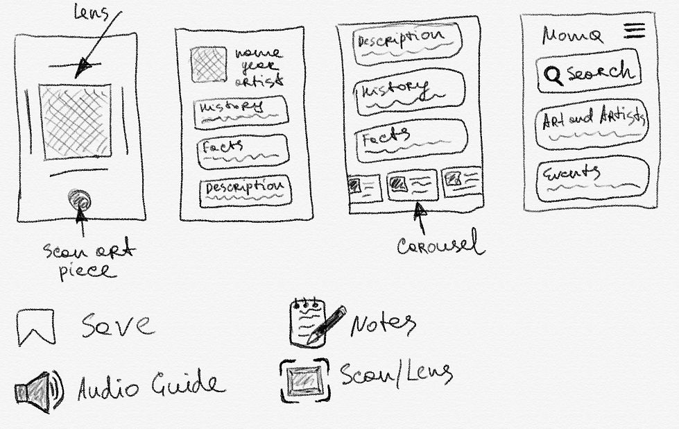
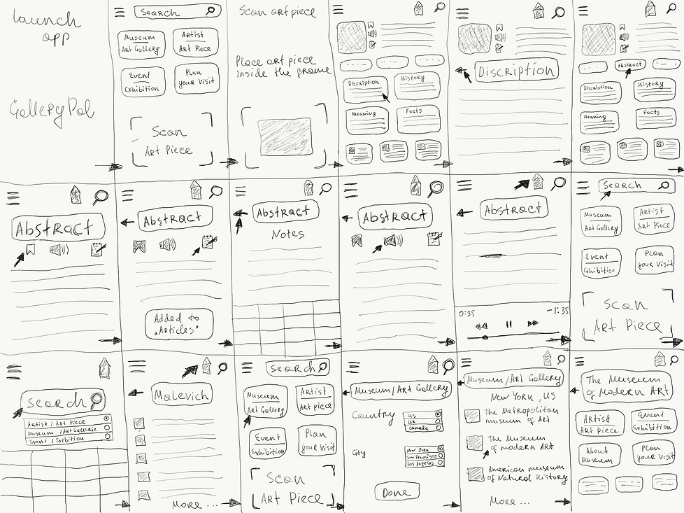
Sketches
I made a few sketches of possible solutions to the most critical screens and elements of my application, that are displayed below:


Design Sprint: Day 3 — Storyboard Creation
The third day was spent on creating the storyboard that shows the interactions which the users will need in order to complete the task while they are using the app.
Each screen includes the necessary UI elements that I will use in the prototype. By storyboarding on a whiteboard, I discovered that one of the benefits of prototyping is that it becomes a lot simpler to import the ideas from the drawings into the low fidelity mockups.
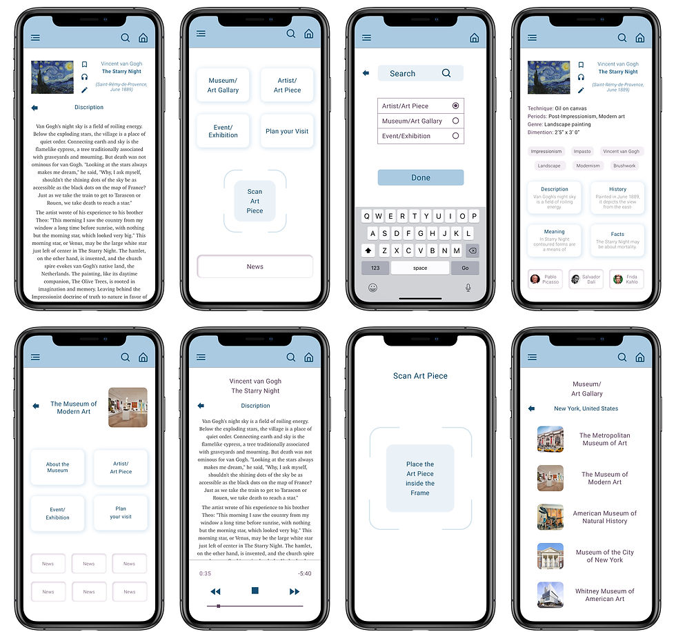
Design Sprint: Day 4 — Prototype
Day four of the design sprint was dedicated to prototyping the solution.
The design sprint prototype is like a realistic facade with screens that are absolutely necessary for the user interaction, in order to complete a specific task. It’s something that I can put in front of the participants to gauge their reactions to the idea.
Below I displayed low-fidelity screens of application:

Design Sprint: Day 5 — Test
On the last day of the design sprint, I tested the prototype with 5 participants to get feedback about the idea and the design from the users.
I gave a few tasks and the imaginary environment to the participants to complete:
The imaginary environment is MoMa, New York (The museum of modern art)
-
Find the information about the artwork in front of the participant
-
Listen to the information about the artwork
-
Write the thoughts and impressions about the art piece
-
Bookmark the page for the future
-
Find the information about the definition
-
Find the recommendations
The imaginary environment is visiting New York
-
Find museums in New York
-
Find the information about the museum
-
Buy the ticket to the museum
-
Find a special event in the museum
-
Find the artwork of the specific artist in the museum
The environment is a general search
-
Find the information about the artist and his works
-
Find the information about the artwork
-
Find events and places to visit
-
Buy the ticket to the museum
I sent the link to the prototype on the Invision and tested the idea. Here are the insights from the user testing:
-
Participants recognized the Lens option and used it as intended
-
Participants could find the information I asked about
-
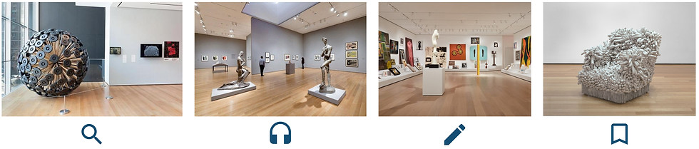
Participants identified icons “Bookmark”, “Audio guide’ and “Notes” and completed the user flow by using them
-
Participants recognized the “Recommendation carousel” on the bottom of the page and found it very helpful to discover more
-
Participants recognized the “Definition tags” relevant keywords for the article and described it as caring and useful for the fast browsing of the corresponding pieces of content.
-
Few participants indicated the font Roboto was not very readable and appropriate for articles. That was a great comment on the area which I did not pay enough attention to. In order, to choose the right font I opened my favorite online publishing platform Medium and discovered the font Charter that I decided to use in the high fidelity prototype.
Bonus
I was so involved in the process that I didn’t want to dwell on the wireframe stage and revived several pages of the low fidelity design.
I chose pastel colors for the product design because a visit to the museum is associated with relaxation, meditation, and reflections where all attention should be concentrated on the masterpieces of art and nothing should distract from the process of pleasure.
Below I displayed the design I made: