“Venue” UX/UI Case Study: Designing the Platform That Connects People With Common Interests
End to end UX Research and UI Design for the Capstone Two Project (Springboard School)
Introduction
In this case study, I will describe all the work and effort that I made to create a user-friendly, clean, and consistent design of the application that helps people to meet new friends, find events and do hobbies together.
Throughout the study of the design project, I followed the project plan that I will be presenting in this case study.
Problem
Making new friends can be hard with the lack of social skills, as we are pretty set in our ways, having old friends, family, and routines. Also with age, our society and modern busy lifestyles are generally making us more isolated, because we no longer have a context for meeting people as we did in college or high school. Friends keep us company through the difficulties of our lives and help us grow, but when people move to a new city or town, fear and social anxiety can keep them from making new friends.
Venue is a product that helps people meet new friends. Its goal is to create a social user experience that will help users get out and do activities in-person.
The company’s location data shows that: on average, only 20% of the people who claim that they are going to attend an event, do actually attend it.
Based on the available information I identified a few tasks that I want to find solutions for:
-
How can I help people who have social anxiety step out and make new friends?
-
What feature(s) should I add so that the number of attendees who commit to attending is more closely aligned with the number of actual attendees?
-
How to help people find events and activities in their regions that are related to their lifestyle
Industry Leaders
At the beginning of the research and in order to come with a solution for the design of my product, I looked at various similar products in the same field and identified who are the industry leaders and how they approached the same problems. Then I found the main experts in the field, such as Meetup, Facebook “Events”, and Eventbrite platforms, and examined the competitor’s products to get an idea and inspiration for my product. In the next section will be described some insights from the competitor analysis.
-
Meetup
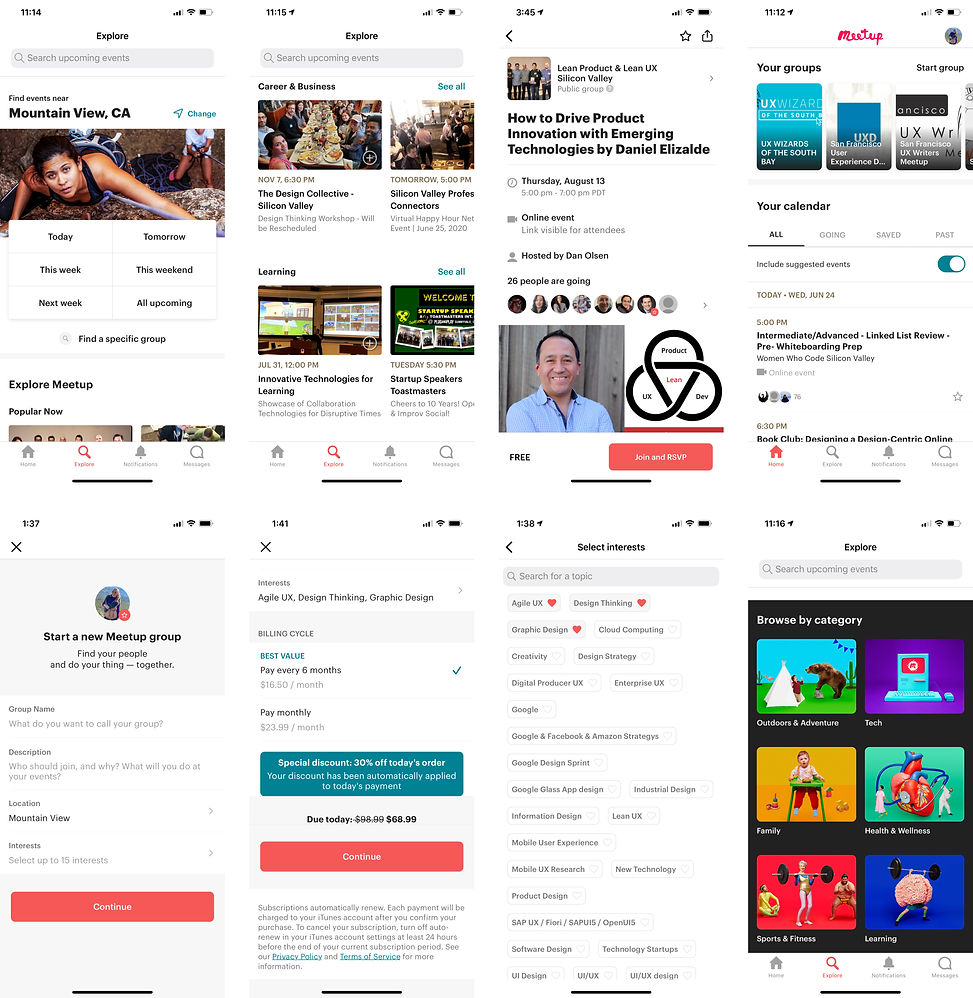
The purpose of the Meetup platform is to connect people with similar interests and find local events or communities. People use the Meetup to meet new people, learn new things, find support, get out of their comfort zones, and pursue their passions together.
The design of the product is user friendly and intuitive. I like the variety of options and recommendations as well as how they are displayed in different types of cards and carousels of cards. I also liked the idea of “Interests” chips and hearts on the user profile, which helps the user to see the events that she/he may like.
I found the “Day picker” on top of the app is a brilliant idea, as it gives the user the opportunity to find the events for the specific day.
“Start group” feature allows the user to create the group for the specific location, date, and interests, but it is not free and requires a monthly subscription without a trial or test option. The latter disappointed me as a first time user because I have never used the product and I don’t know if I like it nor if I need it.
I like the feature “Your Calendar” that allows the user to see or add the category that she/he is “going”, “saved”, or “past”.
The name “Group” for the event is quite confusing and doesn’t sound clear to me. I had to figure out how it works and understand if it is an event or a group that organizes events.
And “Browse by Category” user interface design looks heavy, overwhelming, and not consistent with the design of the product. In addition, there are too many colors on the black background that don’t look attractive to me.
Overall the information architecture is great and it is easy to find any information, group, and event details.
-
Facebook Events

Facebook “Events” feature is a calendar-based resource that can be used to notify users of upcoming events. It is a popular way to explore what is happening in the community, as well as tracking of event details, location, and attendees.
The “Events” allows members to publicize the event, invite guests, and track people who plan to attend. It can be created by anyone, and it can be public or private. The creator can invite friends, members of a group, or fans of a page. Attendees can buy tickets directly on Facebook, share the event with friends, and add it to their Facebook calendar.
The feature has a lot of options to find the event and has carousels of cards with recommended events that are categorized by interests and dates. Additionally, the user can filter and sort events by date, time, online or offline, friends, places, and groups.
The “Calendar” option allows the user to see the events that she/he is hosting or expressed interest in, by choosing the feature: “going”, “interested” or “hosting”. The “Create Event” is a free option that allows the user to create the event for the specific time, date, location, add the co-host and link where the event will take place, choose the theme picture, and to opt-in, or opt-out the option “Guest can invite friends”. It also has an option to make the event public, private, or group. The format of the event can be online or offline.
Finally, my feedback is that I do like the chips (UI elements), carousels of cards, and options like “Interested” and “Share”. However, I feel that the page and cards are too busy and there is not enough white space. In my work, I will make sure to improve these features and make it more organized and clean.
-
Eventbrite

Eventbrite is a US-based event management and ticketing website. The service allows users to browse, create, and promote local events.
Eventbrite brings people together through live experiences to discover events that match their passions, or create their own with online ticketing tools.
Eventbrite Feed displays upcoming events near the user and personalized recommendations. It helps the user to stay up to date on the latest popular events, such as concerts, festivals, yoga classes, holiday events, and networking events.
It allows the user to find events by date, time, and location. It enables the user to buy tickets and keep them on the mobile phone that makes the check-in nice and easy.
The “Search” feature allows the user to search for events by date, location, and subject. It also has an option to filter out the events by type and category. The user can search for free events and sort the events by date and relevance.
The “Tickets” and “Favorites” pages allow the user to see tickets for the events that he/she had bought. In addition, these features enable the user to see the events, organizers, collections, and suggestions that are based on the user’s data activities.
My feedback on Eventbrite is that I like the design of the product and information architecture. However, the product doesn’t use the carousel of cards trend, except “Collections” and offers to customize the feed before opening it.
Finally, the industry leader’s product analysis gave me an idea of what I want to include in the design of my product and what kind of solutions I should avoid.
Company Name & Visual/UI Style
The following presents the brand personality and brand attributes:
Brand personality — a trusted friend that cares about helping people and making a difference in the world.
Brand attributes:
-
Caring
-
Familiar
-
Humorous
-
Optimistic
Based on the brand personality and the brand attributes I created the company name and decided on the color palette, fonts, and style of the UI elements.
-
Logo
“Venue” means meeting point and that name was chosen because it declares the mission of the brand and best aligns with the company’s brand. This Logo consists of the pair of hands that hold/gather/connect people.
The Logo was created from the icon that I found on the https://www.flaticon.com/ and modified by changing the color, border width, and elements.
-
Color
Below presented the color palette for the visual style of the product.

The color #4A7896 and its gradient is the primary color of the product that is used for the CTA buttons, Content, UI elements, and Icons.
The color #7D345F is the secondary color that is used for the context, text, and borders of the fields.
In addition, the FFFFFF white color is the background color and the color for UI elements.
-
Font
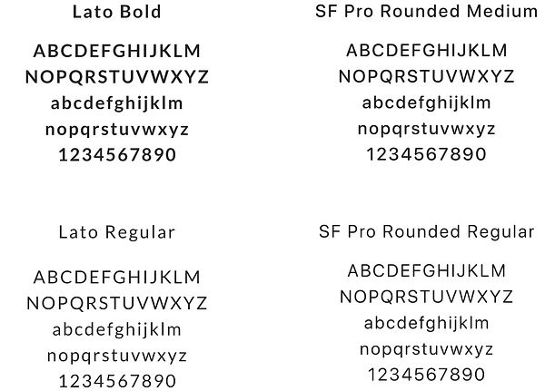
I chose two types of fonts for the Venue application: SF Pro Rounded and Lato as they go well with each other.
The San Francisco Family will be used for the CTA buttons and the UI elements. The Lato Family is used for the Context.
San Francisco is a neo-grotesque sans-serif typeface made by “Apple Inc.”, It was first released to the developers on November 18, 2014. It is the first new typeface designed at Apple in nearly 20 years and it has been inspired by Helvetica and DIN.
Lato is a sans serif typeface family designed in the Summer 2010 by Warsaw-based designer Łukasz Dziedzic (“Lato” means “Summer” in Polish). In December 2010 the Lato family was published under the open-source Open Font License by his foundry tyPoland, with support from Google.
-
UI Elements
By this stage, I developed an idea of how the basic UI elements will look like. I then created the artboard that represents the basis of the product’s visual styles.
All icons were created from the icons that I found on the https://www.flaticon.com/ and modified by changing the color, border width, and elements.

Project Plan
The project plan is a very useful tool that designers use to stay organized while working on the design project. It was created for this project to outline all the steps, methods, deliverables, and time estimates in order to complete the work.
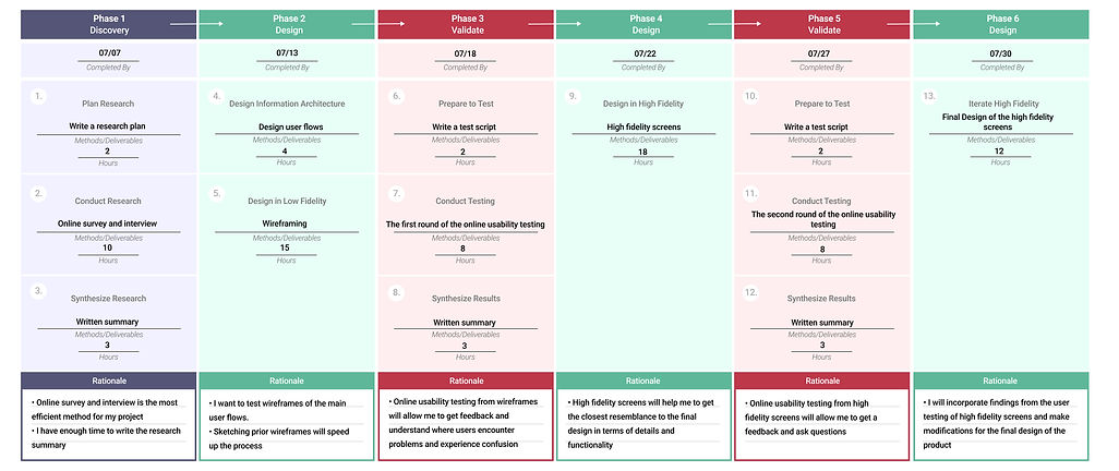
The project plan consists of six phases: Discovery, Design, Validate, Design, Validate, Design. The following describes every one of those phases:
-
Phase 1 (Discovery), I estimated the timelines for each of these steps: write the research plan, conduct the survey, perform the interview, and write the research summary.
-
Phase 2 (Design), I have put together the plan to create the design user flows, sketches, and wireframes.
-
Phase 3 (Validate), I planned the test script, the first round of the usability testing, and how to synthesize the results from the testing.
-
Phase 4 (Design), I intended to design the high fidelity screens for the MVP (Minimum viable product) version.
-
Phase 5 (Validate), I estimated the timelines to write the test script for the second round of the usability testing, conduct the testing and synthesize results in the report.
-
Phase 6 (Design), is dedicated to the final design of the high fidelity screens.
Timelines were estimated for the completion of all the phases listed above. The project was completed on the target time without any delays. In addition. all the tests were conducted online using skype due to the circumstances of the COVID-19.
Sketching
From my previous projects, I have concluded that “Sketching Always Comes Before Wireframing”. Therefore, I started thinking about the user experience, brainstorming ideas, and how the user interface would look like and work, in order to get the desired result. Then, I drew a few screens of the product that I am displaying below:


Sketching allowed me to visualize the screen-to-screen interaction and the basic concept of how the app will work in the user interface form.
User Flow
The application user flow of the important functionalities was created and is presented below. Its objective is to take the user from the entry point using a set of steps that lead to the successful completion of the task.

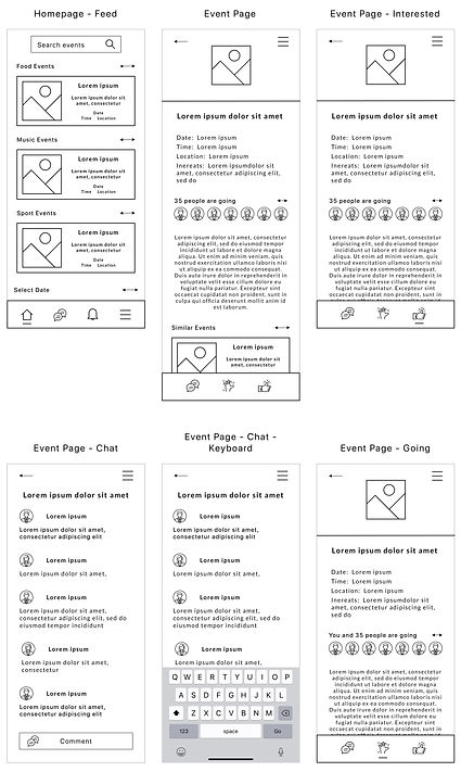
Wireframing
Wireframing is the foundation of the interface (UI) and the way to design the software product at the structural level with the layout content on the page that takes into account user needs and user journeys.
The wireframes of the page’s interface were created to focus on the space allocation and prioritization of the content, functionalities, and intended behaviors. Wireframing helped me with the informational architecture that is presented below.


Usability Testing Round One
Three moderated usability remote tests of the Venue application wireframe were conducted, in order to test the low fidelity pages. Skype video calls were used throughout the tests.
Before the usability testing, and the expected set of goals were established to be achieved during the research:
-
Understand how real users interact with the product
-
Find out usability problems that should be improved
-
Identify if the users can complete tasks successfully
The usability tests were moderated by me. I provided the participants with three different start points and flows to complete. The tests consisted of 18 completed tasks that I listed below:
-
Please, look at the screen and explain what kind of information you see and share your idea about what you see.
-
When you look at the screen, what kind of options do you see available?
-
Imagine that you are interested in a particular subject. How would you find more events like it?
-
For the first task please find the event you are interested in.
-
Now, please find the detailed information about the event.
-
Please comment on what you see on the event page.
-
Please tell me if there is some more information you would like to see on the event page.
-
What would you do if you have some questions about the event?
-
Imagine you like the event and you are not sure yet if you can attend it. What would you do to save the event page and show your interest?
-
Now let’s imagine that you know for sure you will be able to go to the event. What would you do to inform the host that you are going?
-
What did you notice on the page after your action?
-
Now let’s try to find the particular event that you are interested in. How would you do it?
-
Please imagine that you are looking for a particular event on a specific day.
-
Please imagine that you are looking for events that are happening in eating places.
-
How would you find the event if you like to pair a glass of wine with lasagna or pepperoni?
-
What do you think you would do if you like to find friends and try Vietnamese food on the specific day and location and couldn’t find any matching event?
-
Please organize your own event and explain every step you will make.
-
And the last request is, please, share your thoughts about your experience.
During the interview, I discovered a few very important user interface and information architecture issues, that are presented below:
-
The users want to see the Location feature on top of the screen and the option to edit it
-
The users want to see who is the host or event organizer on the event page and some information about them
-
The users advised redesigning the Carousel card, where they could see the next card in a row
-
The users guessed that having Calendar on top of the screen could be helpful and convenient
-
The users asked where they could see the event fee or is it free
-
The users noted that the Interests and Categories carousel will look better in one row
-
The users emphasized that Interest chips and categories cards will look better in a smaller size
-
One of the users recommended keeping all the objects on the same grid when designing the high fidelity prototype of the application
Finally, usability testing was extremely useful and informative for creating intuitive, user-friendly, and quality products. All issues mentioned above will be fixed and redesigned during the high fidelity stage which will be discussed in the next section.
Usability Testing Round Two
Three moderated usability remote tests of the Venue application High Fidelity Design Screens were conducted in order to test the high fidelity design screen. Skype video calls were used throughout the test.
The usability tests were moderated by me. The participants were provided with three different start points and flow to complete. The tests consisted of 18 completed tasks that I used for usability testing round one.
Throughout the interview, a few very important user interface and information architecture issues were discovered and are presented further below:
-
All the users were able to complete their tasks successfully
-
The participants found the design user-friendly and clean
-
One participant recommended making the font smaller on the user profile page
-
Most of the users liked the information architecture
-
Some participants asked questions regarding other options that are not working at this stage
Based on the findings that I uncovered throughout the usability testing, few necessary changes were made in the high fidelity designs section.
High Fidelity Design
At this stage, the final design of the Venue application was created and it is presented below.
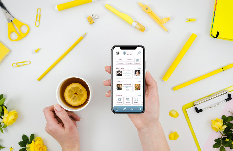
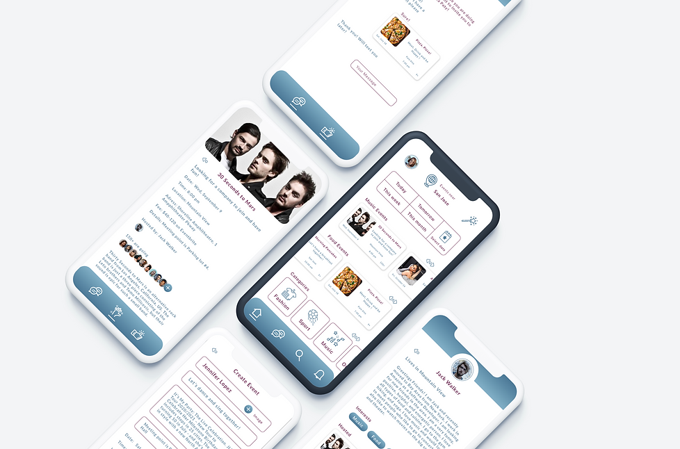
Home Page

Music Events

User Page

Card Scroll Down

Search Options

Create Event, Menu, Sign In Page

Animation


Conclusion
That was my second project for the Springboard UX/UI design school where I used my skills and knowledge. I learned more about the UX design process and revealed some new features of the design tools.
During this project I learned how to create the project plan, set deadlines, estimate timelines, and complete all tasks without delays. That time management skill is very important for the self-organization and working productively in the team.
I also polished my skills in the primary research, heuristic competitors analysis, sketching, information architecture, high and low fidelity design.